Skypaws - Simplifying the complex process of flying with pets
Category:
UX/UI Design
Team:
Hattie Li (Personal project)
Timeline:
6 Weeks
Tool:
Figma · Adobe Suits
My Role:
UX research · UI/UX Design · User testing

Overview
Skypaws is a one-stop platform that streamlines the process of flying with pets—allowing users to book both human and pet tickets simultaneously, upload and manage required travel documents, and access AI support 24/7.
Background
🇺🇸 In the U.S., more than 66% of households own at least one pet, and 78% of pet owners travel with their pets annually. Despite this growing demand, booking a flight for a pet remains a fragmented, confusing, and time-consuming process.
66%
of U.S. households own a pet
78%
of U.S. pet owners travel with their pets annually
97%
of U.S. pet owners say pets are part of their family
68%
of pet owners didn’t know the required travel docs
User Interview - Qualitative Research
Questionnaire / Survey - Quantitative Research
From the combined results, I identified three recurring pain points:
Pet tickets had to be booked separately, often via multiple sites or calls.
Unclear doc requirements caused stress and fear of denied boarding.
No way to track or confirm pet travel approval.
Persona
SkyPaws is built for people who fly with pets, especially first-time and frequent companion animal travelers who need an easier way to book tickets, manage documents, and get reliable support.
I also consider service dog travelers as key secondary users, with unique but equally important needs.


Solution
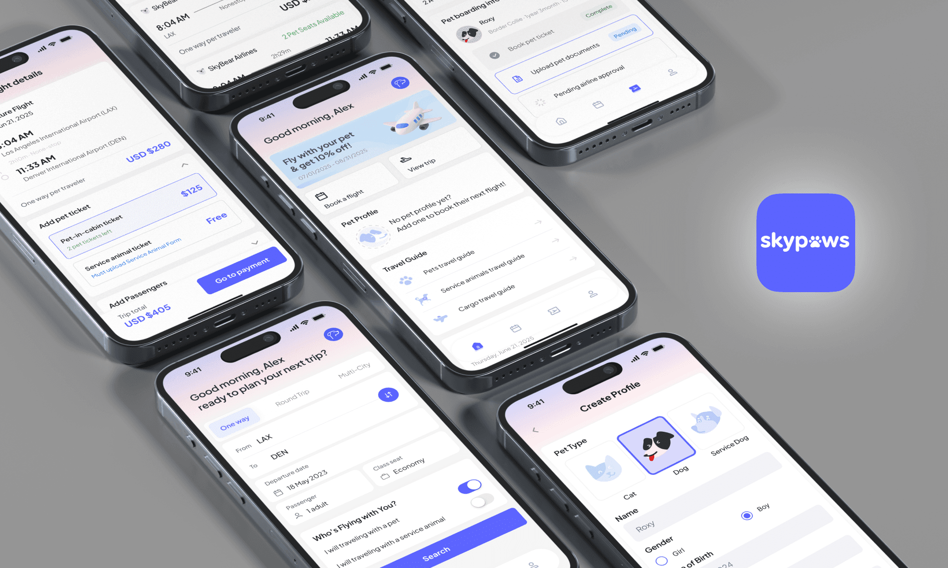
Skypaws simplifies air travel for pet owners through a unified booking and travel management experience. It is a platform that helps users book both human and pet tickets, upload required documents, and access AI-powered support, making the entire pet travel process clear, convenient, and stress-free.
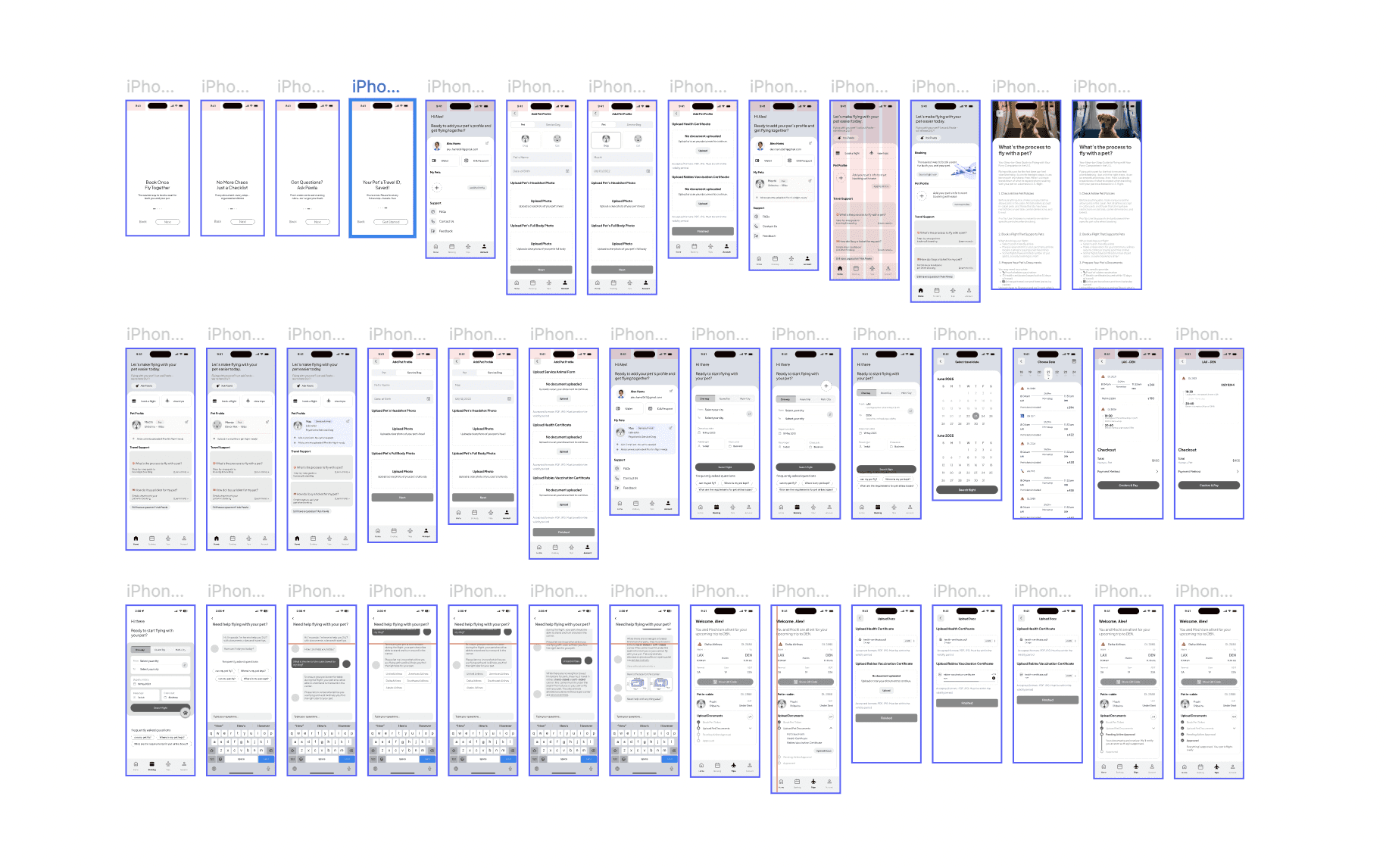
Wireframes
User Testing & Design Iteration
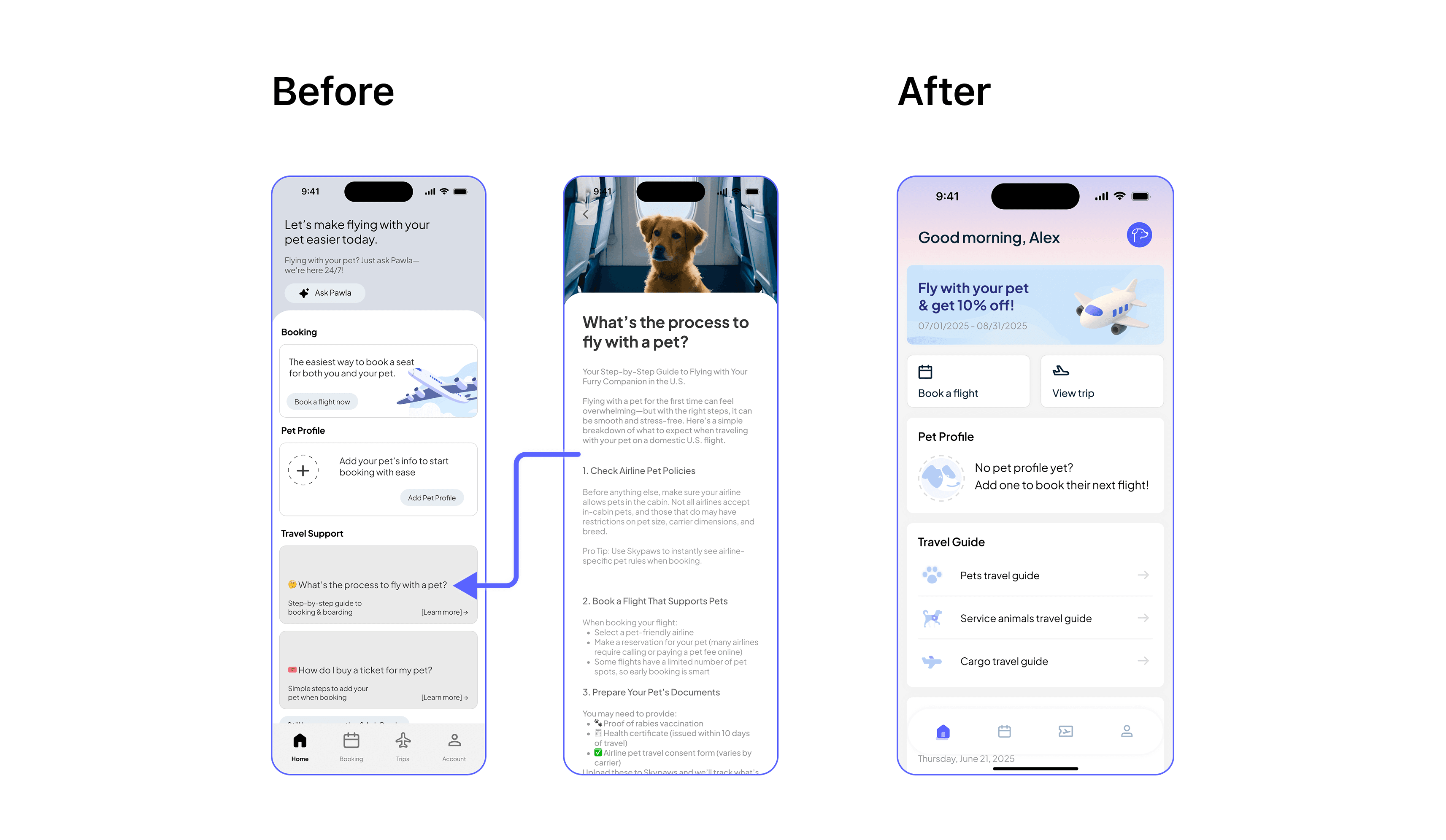
# 1 Improved information accessibility
Testing Feedback
Design Decision #1
Initial user testing showed the article section too text-heavy and inefficient for quick information access.
I replaced it with a structured Pet Travel Guide in three clear sections, improving clarity, speed, and overall user experience.
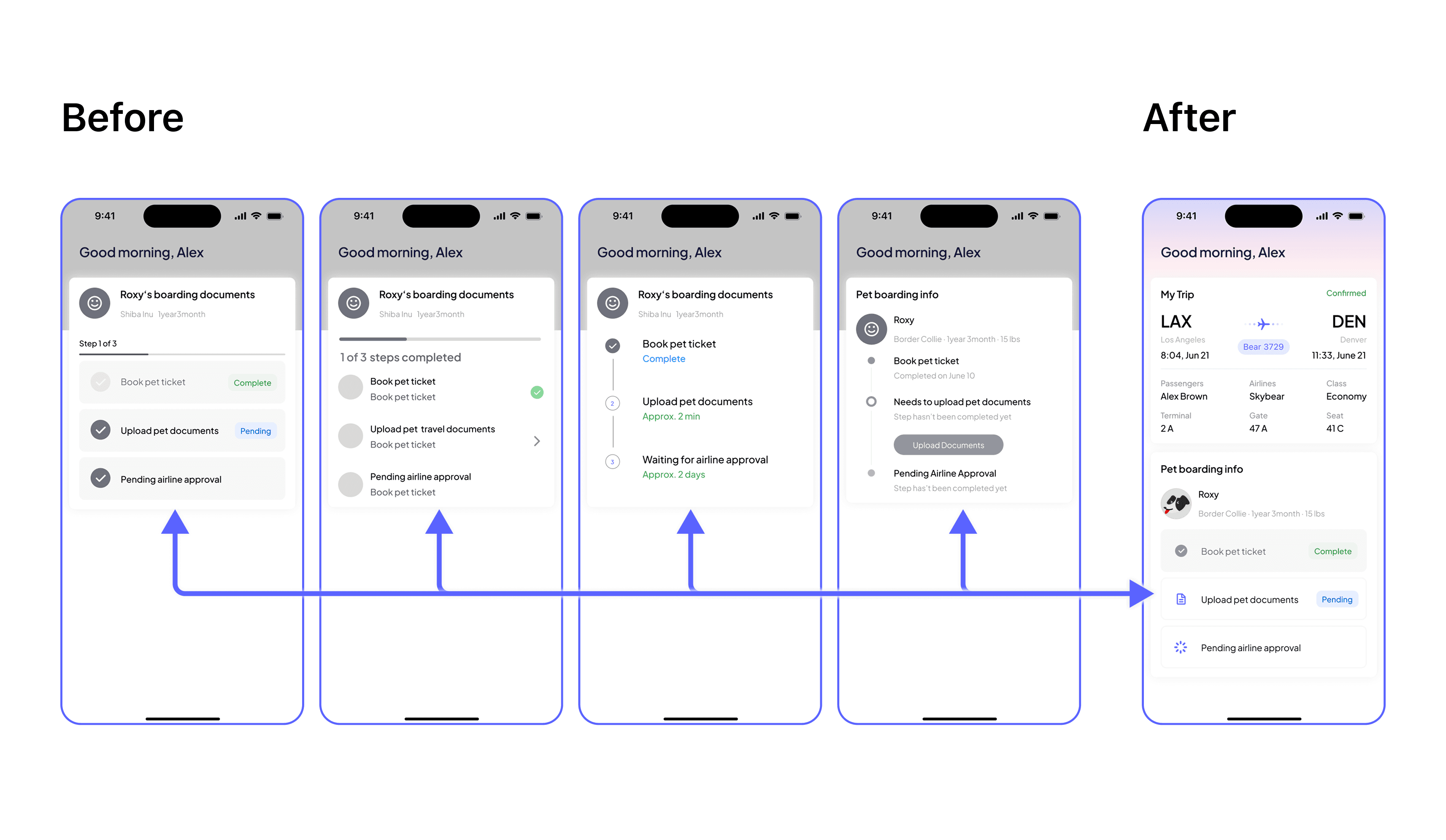
# 2 Step indicator
Testing Feedback
Design Decision #2
During user testing, I explored vertical flows, horizontal step layouts, and progress bars. Users found the progress bar redundant, as it repeated the step information. While vertical flows offered more visual space, they felt less focused and required more cognitive effort to scan.
I implemented a horizontal step-by-step task list with clear status indicators (e.g., Complete, Pending), replacing the progress bar. This improved clarity and helped users quickly understand their current progress and the next required action.
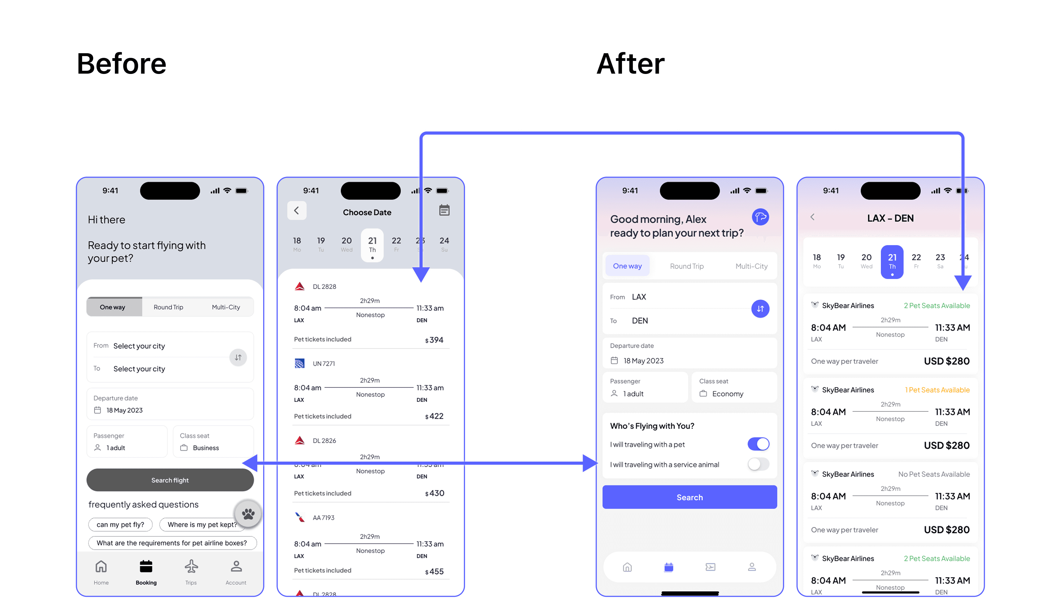
# 3 Improving Visibility of Pet Travel Options
Testing Feedback
Design Decision #3
User testing showed the need to highlight pet travel choices early and show seat availability, since U.S. airlines limit pet capacity per flight.
I added a “Who’s flying with you?” section to help users choose between a pet or service dog, making the experience more emotionally engaging. On the results page, I used color-coded pet seat indicators to support quicker, informed bookings.
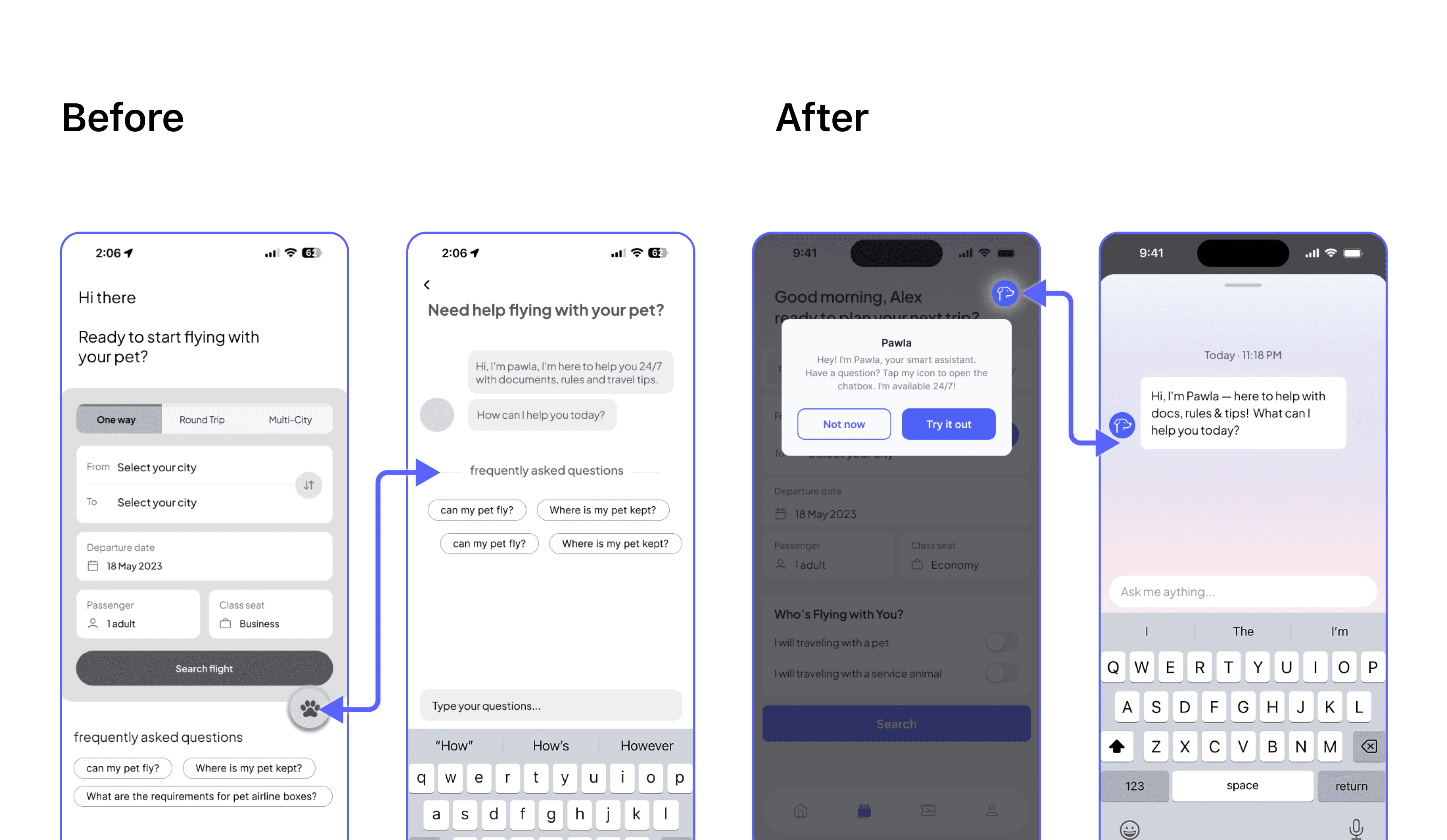
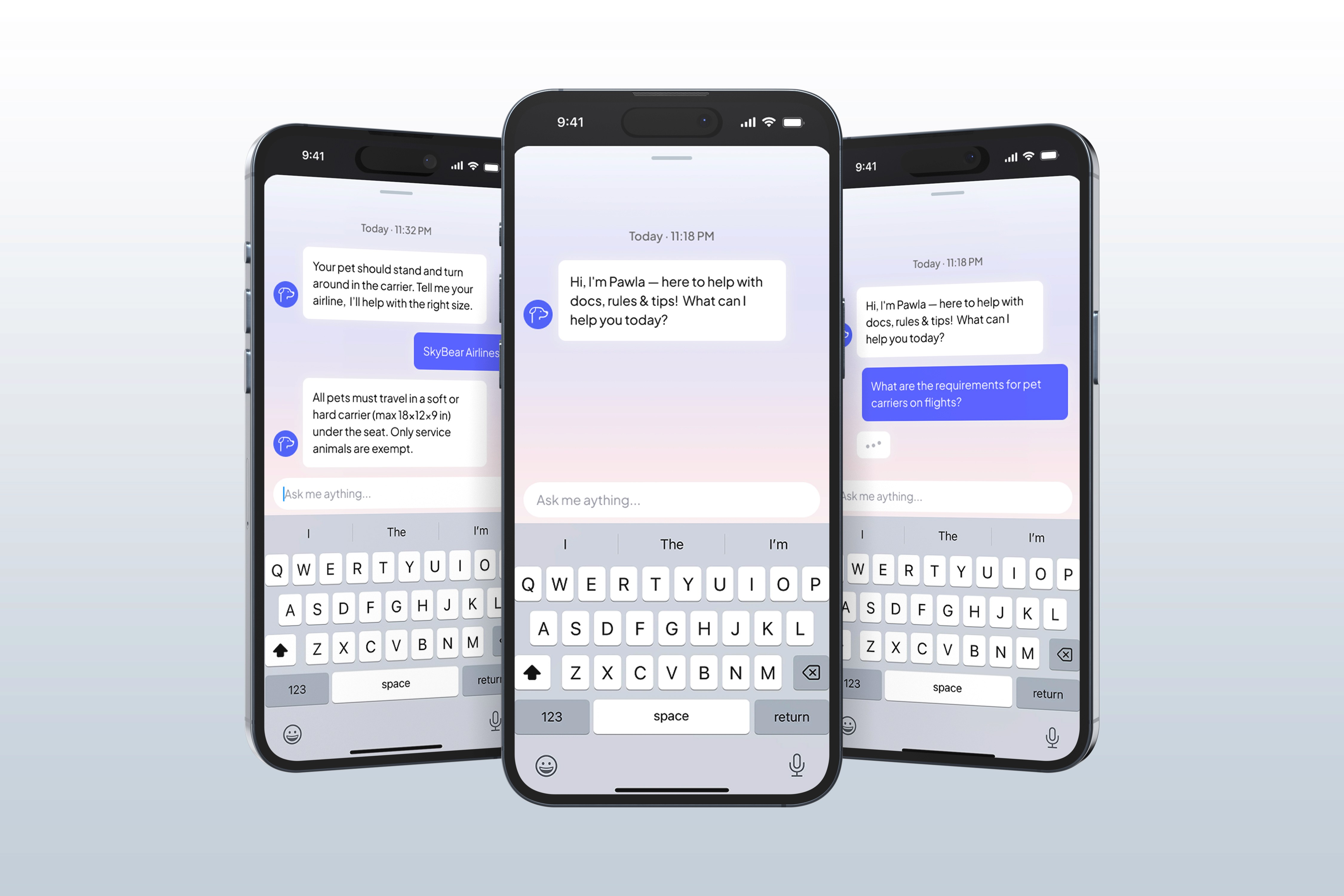
# 4 AI Assistant Visibility and Onboarding
Testing Feedback
Design Decision #4
Initial users found the floating paw-shaped button confusing and unclear as an entry point to the AI chatbox. It was also easy to accidentally tap, which disrupted their flow.
I replaced it with a dedicated AI assistant icon placed consistently at the top-right of each page for easier access. For first-time users, I also added an onboarding message introducing “Pawla” and guiding them to start a chat.
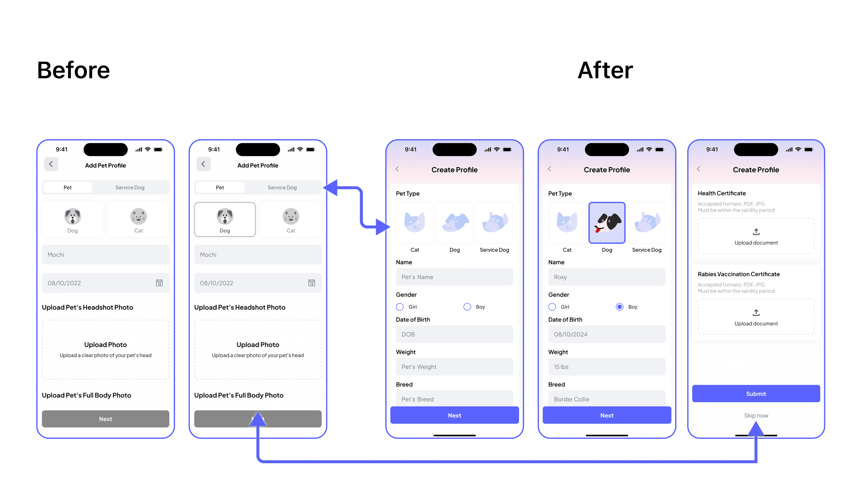
# 5 Improving Add-Pet Flow
Testing Feedback
Design Decision #5
Users found the segmented control unclear and said it was easy to overlook the service dog option. Many also got stuck when asked to upload documents right after entering basic info—either because they didn’t have the files on hand or simply wanted to do it later—which disrupted the flow.
I replaced the segmented control with a three-panel layout (Cat / Dog / Service Dog) for better clarity and inclusion. I also split the add-pet flow into two steps: first, basic info input; second, document upload, with a skip option for flexibility.
Final Design - Key Flow
Problem: Messy Booking
Pet tickets often had to be booked separately, often through phone calls, making the process complicated and frustrating.
✅ Solution
I created an all-in-one booking flow where users can select pet or service dog travel from the start, view pet seat availability on each flight card, and add a pet ticket directly during checkout—all within the same flow.
Problem: Unclear paperwork & Lack of visibility
Users were unsure what documents to submit and had no way to track approval status, leading to confusion and stress.
✅ Solution
I created a 3-step Pet Boarding section: ticket purchased, documents uploaded, and approval pending. Each with clear status labels, helping users stay on track and informed throughout the process.
Lack of Instant Support
Users had lots of questions: what documents to upload or which carriers to use, but no easy way to get answers.
✅ Solution
I added a AI assistant icon on every page. “Pawla” is always there to help with pet travel questions, making the experience smoother and less stressful.
Repetitive Uploads Every Time
Users had to re-enter pet info and re-upload documents every time they booked a flight, which was repetitive and time-consuming.
✅ Solution
I added a Pet Profile section where users can save and manage pet info and documents. Once saved, they can quickly reuse the profile during future bookings, no need to upload the same files again.
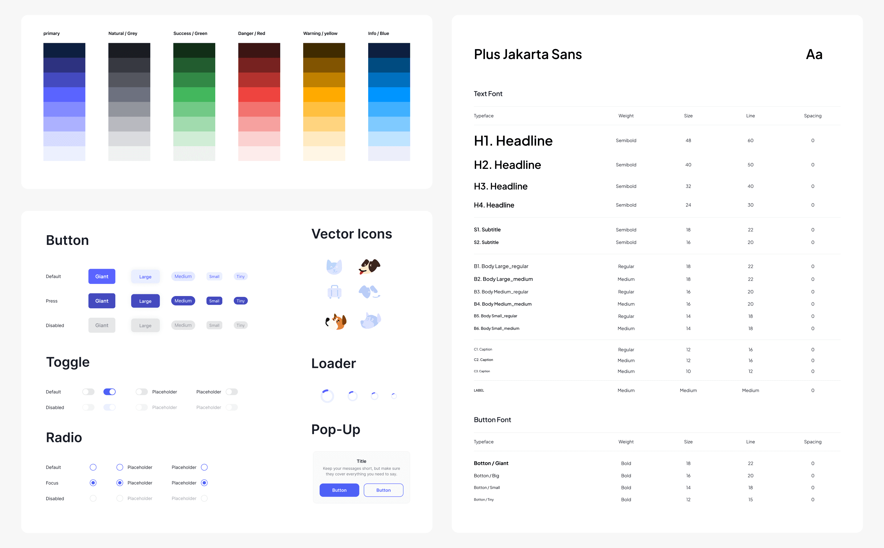
Design System
What I Learn
📊
I design with data, not guesswork
User feedback shaped every key decision, I learned to let real behavior guide the design.
🐕🦺
Empathy for edge cases
Designing for pet travelers taught me to spot overlooked needs and design beyond the “typical” user.
🔄
Flexibility matters
Not every user is ready to finish everything at once. Good UX lets people come back when they’re ready.